Monday, November 3, 2008
A fresh look at scrolling...
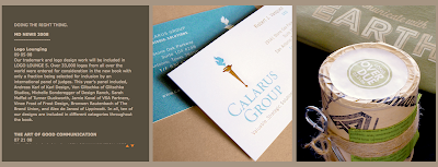
This website had such a cool idea that really was so simple...it makes me mad I didn't think of it first! Most websites out there have some form of 'scrolling' down the page which is ok, but sometimes you can get so tired of scrolling you think - will this ever end? Well this design company (Murillo Design) came out with this idea of scrolling across instead of up and down and it looks so cool that I instantly was taken with this idea. Check it out and see what you think!


Subscribe to:
Post Comments (Atom)
1 comment:
Thanks for the kudos. I'm glad you enjoyed it.
- Roland
Creative Director
Murillo Design, Inc.
Post a Comment